3.1 KiB
Storybook


Storybook is a development environment for React UI components. It allows you to browse a component library, view the different states of each component, and interactively develop and test components.
Intro
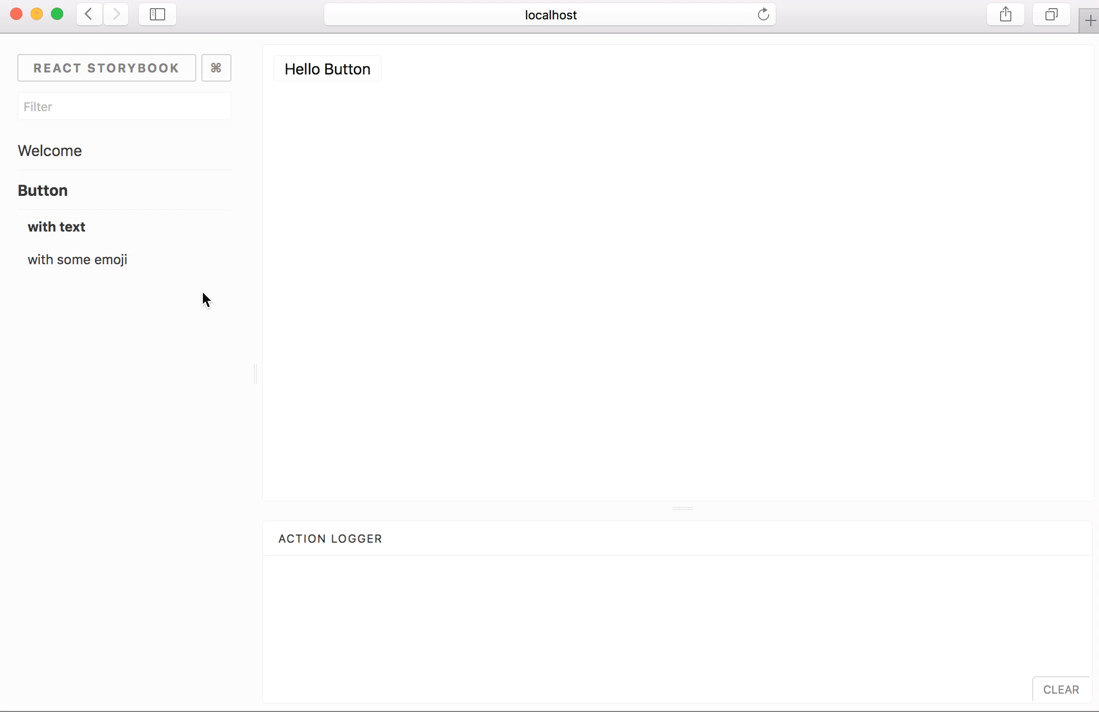
Storybook runs outside of your app. This allows you to develop UI components in isolation, which can improve component reuse, testability, and development speed. You can build quickly without having to worry about application-specific dependencies.
Storybook comes with a lot of addons for component design, documentation, testing, interactivity, and so on. Storybook's easy-to-use API makes it easy to configure and extend in various ways. It has even been extended to support React Native development for mobile.
Getting Started
First install storybook:
npm i -g getstorybook
cd my-react-app
getstorybook
Once it's installed, you can npm run storybook and it will run the development server on your local machine, and give you a URL to browse some sample stories.
For full documentation on using Storybook visit: https://getstorybook.io
Main Projects
- react-storybook - Storybook for React components
- react-native-storybook - Storybook for React components
- storyshots - Easy snapshot testing for storybook
- getstorybook - Streamlined installation for a variety of app types
- examples - Code examples to illustrate different Storybook use cases
Addons
- addon-actions - Log actions as users interact with components in storybook
- addon-comments - Comment on storybook stories
- addon-graphql - Query a GraphQL server within Storybook stories
- addon-info - Annotate stories with extra component usage information
- addon-knobs - Interactively edit component prop data in the Storybook UI
- addon-notes - Annotate storybook stories with notes
- addon-options - Customize the storybook UI in code
Contributing
We welcome contributions to Storybook! There are many ways to contribute to this project. Get started here