---
title: "What's a Story"
---
A story captures the rendered state of a UI component. Developers write multiple stories per component that describe all the “interesting” states a component can support.
The CLI created example components that demonstrate the types of components you can build with Storybook: Button, Header, and Page.
Each example component has a set of stories that show the states it supports. You can browse the stories in the UI and see the code behind them in files that end with `.stories.js` or `.stories.ts`. The stories are written in Component Story Format (CSF)--an ES6 modules-based standard--for writing component examples.
Let’s start with the `Button` component. A story is a function that describes how to render the component in question. Here’s how to render `Button` in the “primary” state and export a story called `Primary`.
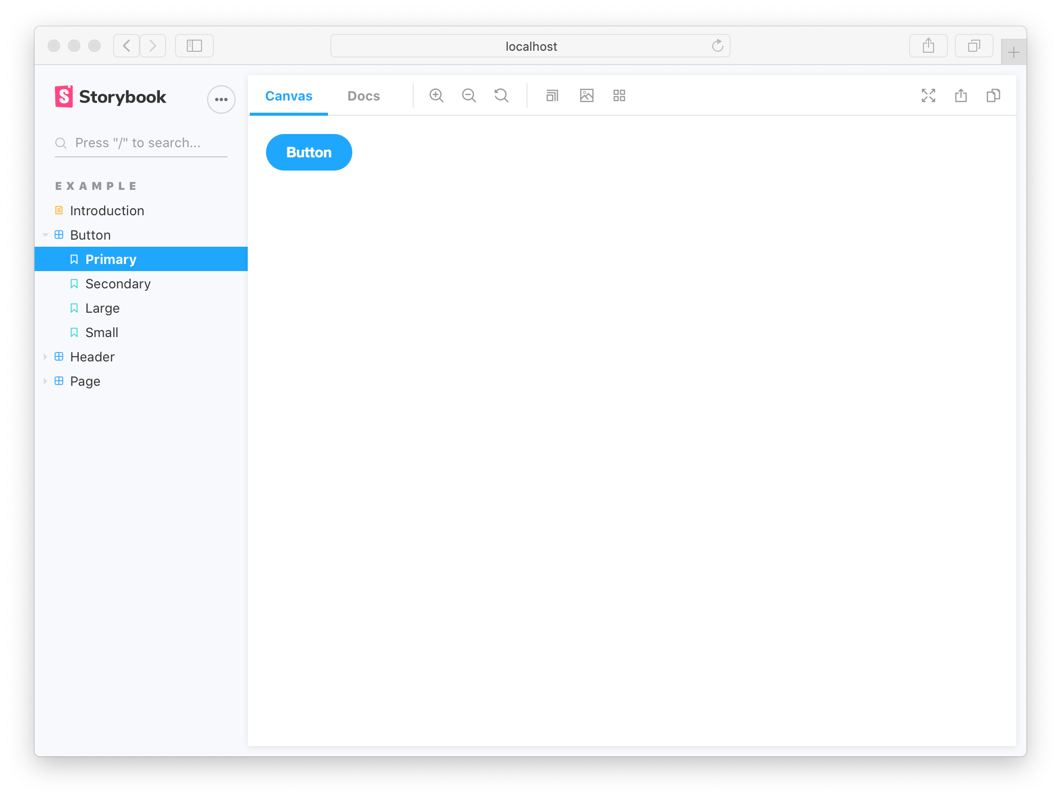
View the rendered `Button` by clicking on it in the Storybook sidebar.
The above story definition can be further improved to take advantage of [Storybook’s “args”](../writing-stories/args.md) concept. Args describes the arguments to Button in a machine readable way. This unlocks Storybook’s superpower of altering and composing arguments dynamically.
```js
// We create a “template” of how args map to rendering
const Template = (args) => ;
// Each story then reuses that template
export const Primary = Template.bind({});
Primary.args = {
primary: true,
label: 'Button',
};
```
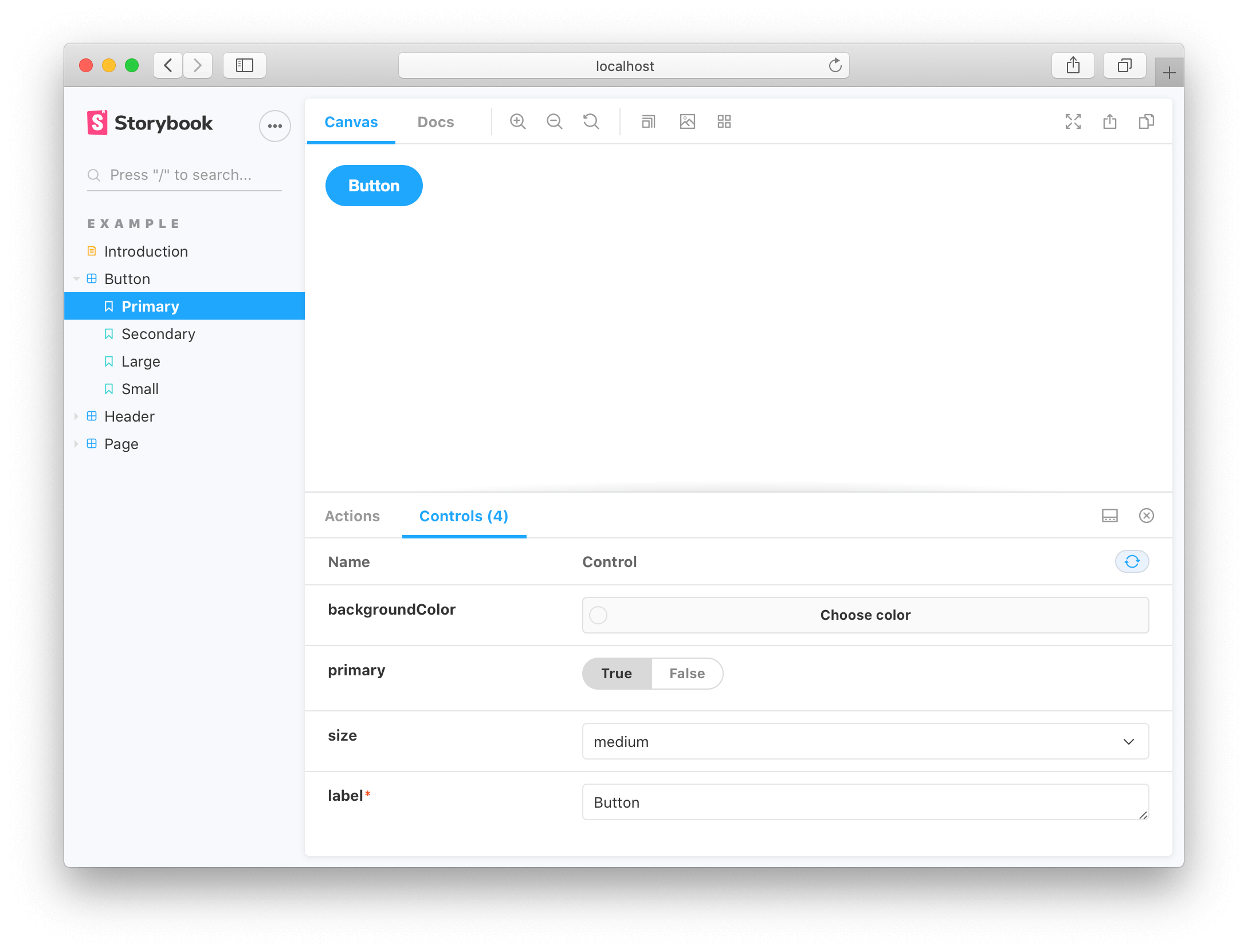
Both story examples render the same thing because Storybook feeds the given `args` property into the story during render. But you get timesaving conveniences with args:
- `Button`s callbacks are logged into the Actions tab. Click to try it.
- `Button`s arguments are dynamically editable in the Controls tab. Adjust the controls
Note that `Template.bind({})` is a standard JavaScript technique for making a copy of a function. We copy the `Template` so each exported story can set its own properties on it.
### Edit a story
Storybook makes it easy to work on one component in one state (aka a story) at a time. When you edit the Button code or stories, Storybook will instantly re-render in the browser. No need to manually refresh.
Update the `label` of the `Primary` story then see your change in Storybook.
Stories are also useful for checking that UI continues to look correct as you make changes. The `Button` component has four stories that show it in different use cases. View those stories now to confirm that your change to `Primary` didn’t introduce unintentional bugs in the other stories.
Checking a component’s stories as you develop helps prevent accidental regressions. Tools that integrate with Storybook can also [automate](..workflows/testing-with-storybook.md) this for you.
Now we’ve seen the basic anatomy of a story, let’s see how we use Storybook’s UI to develop stories.